
Our review
 Analysis by Lookingapps
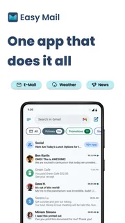
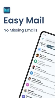
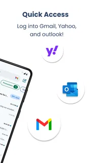
I judge an email app less by how many buttons it offers than by whether it makes the small, repetitive checks of daily life less annoying. Easy Mail is built around that kind of convenience: it brings email within quick reach through swipe-based inbox access, a home-screen widget, and quick replies. I see it as a lightweight personalization app for people who want their inbox to feel closer at hand, rather than a wholesale replacement for every email tool they already use.
Quick access is the main idea
The appeal of Easy Mail is easy to understand if you often check email in short bursts. Instead of treating the inbox as a place you visit only when you open a dedicated mail app, it puts access closer to the home screen and makes replying feel more immediate. That can be useful when you are waiting for a delivery update, keeping an eye on a school message, or checking whether a colleague has answered a simple question.
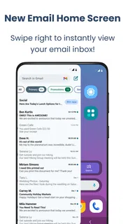
The swipe-access approach is the part I would consider first. It is designed to shorten the route from using the phone to reaching the inbox, which suits a quick glance better than a full email session. The widget serves a similar purpose by keeping email visible in the home-screen environment. Quick replies round out the idea: for a short acknowledgement or a straightforward answer, you may be able to respond without turning a small task into a longer interruption.
That focus also defines the app’s limits. Easy Mail is not best understood as a broad email-management suite. Its value depends on whether faster access and simple replies matter more to you than advanced organization, detailed controls, or a particular provider’s full-featured client. If you mainly want to deal with small messages promptly, the narrower focus can be a strength. If email is where you manage complex work, the convenience layer may not be enough on its own.
Where it fits in an everyday routine
Picture a weekday morning: you are getting ready to leave, expecting a message about an appointment, and do not want to open your inbox repeatedly. A home-screen widget offers a handy place to check, while swipe access can make a quick visit feel less like switching tasks. If the message only needs a brief reply, quick responses help you close the loop before you move on.
The same pattern works for a parent checking a school update between errands, or someone waiting for a confirmation before heading out. These are not situations where you need to sort a crowded archive or compose a long message. They are moments where the useful outcome is simply seeing what arrived and deciding whether it can be handled now.
One practical tip is to treat the widget as a triage point, not as a reason to monitor email constantly. Use it when you have a real reason to watch for a message, then return to your normal routine. The convenience of visible access can otherwise encourage more checking than the messages deserve. For people trying to reduce phone interruptions, the app’s quick route is most helpful when paired with intentional habits.
More articles

Instagram Makes Everyday Moments Worth Sharing
A rare social app that can be a photo diary, a neighborhood window, and a lively conversation in the same session—though its best moments still require a little restraint.
What the current release tells me
Easy Mail is a free app in the personalization category, developed by App Lab Studios. It has an average rating of 4.2 from around 33,000 ratings, with about 8,500 written reviews and more than a million installs. Those figures suggest that many people have tried the app, while the rating points to a generally positive but not universal response. I would read that as a reason to consider its convenience, not as proof that it will suit every inbox routine.
The app was released on November 22, 2023, and its current version is 1.03.06. That gives a useful snapshot of its present state, but a version number alone does not tell me which features have changed or how the experience has evolved between releases. I would avoid assuming that a newer-looking version number means a particular improvement. What matters for a potential user is whether the current set of access and reply tools matches the way they check email.
For someone already using it, the version is a reminder to check that their installed copy is current if they are troubleshooting or comparing notes with another user. It is not, by itself, a reason to expect a new workflow. I would judge updates by what changes in the actual experience: whether quick access remains dependable, whether the widget continues to be useful, and whether replying stays simple. Those are the parts of the app that carry its promise.
The minimum operating system is version 10, and the content rating is Everyone. That makes the intended audience broad, though compatibility still depends on the device and its software. If your phone does not meet the minimum requirement, this is not an app to plan around. If it does, the next question is whether you want email access integrated into your home-screen habits rather than confined to a conventional mail client.
How it compares with a standard mail app
A conventional email app is usually the better choice when your priority is managing the whole lifecycle of messages: composing carefully, finding old threads, sorting, or working through a large inbox. Easy Mail’s distinguishing idea is more about proximity. It aims to make it easier to reach email and handle uncomplicated replies, rather than asking you to reorganize your entire mail workflow.
That difference can make the two approaches complementary. You might keep a full-featured client for longer sessions and use Easy Mail when you want a faster check from the home screen. The trade-off is that another layer of access can add a step if you already have a well-tuned mail setup. If your existing app already gives you the widget and quick actions you need, Easy Mail may bring less practical value than it does for someone whose current routine requires too many taps.
It is also worth being realistic about quick replies. They are most useful when the message calls for a short, clear response. For sensitive conversations, detailed explanations, or anything that needs careful wording, I would still open a full mail interface and take the time to review the message before sending. Fast does not always mean better, and a convenient reply path should not encourage a rushed answer.
Costs and the trade-offs to consider
The app is free to download, with in-app purchases ranging from $9.99 to $59.94 per item. I would start by trying the free experience and deciding whether the faster access becomes part of your routine before considering a purchase. The existence of paid items means you should check the purchase details in the app store and in the app itself rather than assume every option is included at no cost.
For a casual user who checks email only a few times a day, the free version may be all they need, depending on what is available in it. Someone who relies on home-screen access throughout the day may see more reason to explore the paid options, but I would compare the value against the features they actually use. Paying for convenience makes sense only when it saves enough friction in your own routine; a price range does not tell you which item is right for you.
The main friction is not that the idea is complicated, but that an extra email access tool must earn its place. If you already have notifications, widgets, or shortcuts that solve the same problem, installing another app can make your setup feel more cluttered. Likewise, if you prefer to check email only during planned blocks, a prominent inbox widget may be counterproductive. In that case, a standard mail app kept out of sight could better support your habits.
Who I would recommend it to
I would suggest trying Easy Mail if you repeatedly open your inbox for one quick check, or if short replies are a frequent part of your day. It is especially appealing when email is important enough to monitor but not so complex that every visit requires a full work session. The app’s age rating of Everyone also reflects a broadly accessible product rather than one aimed at a narrow specialist audience.
I would be more cautious if your inbox is a serious work hub, if you depend on detailed mail organization, or if you are already happy with the access tools in your current client. In those cases, a full email app may be more dependable as your central workspace, and Easy Mail may feel like duplication. I would also skip it if you are trying to cut down on phone checking and know that a visible inbox would tempt you to look more often.
Before settling into it, I would test the three core parts separately. First, see whether swipe access is comfortable and easy to use in your normal phone routine. Then check whether the widget gives you genuinely useful visibility without becoming visual noise. Finally, try quick replies on a low-stakes message and decide whether the shorter workflow still gives you enough room to respond thoughtfully. This small trial tells you more than judging the app by its concept alone.
What I would watch as it develops
For existing users, the most meaningful signs of progress would be improvements that preserve the app’s central convenience without making it feel busier. I would watch how the swipe route, widget, and quick replies work together in everyday use. A change that adds complexity but does not make checking or answering easier would be less valuable than a modest refinement to the core routine.
For new users, I would keep expectations tied to what is evident now: Easy Mail is focused on bringing email closer to the home screen and making brief replies easier. Its release date and current version provide context, but they should not be treated as a promise of upcoming functions. If you are choosing it today, decide based on the present tools and the way you personally use email.
Overall, I see Easy Mail as a practical convenience app rather than a universal email solution. Its best case is a person who wants a faster glance and an easier way to handle simple messages, while still recognizing when a full mail client is the better workspace. I would try it if email checks interrupt your day in small, repetitive ways; I would pass if your current client already makes those checks effortless or if less inbox visibility is what you need.
Pros
- Quickly opens your chosen email app from a simple launcher.
- Can make email access easier for users who prefer fewer steps.
- Useful as a lightweight shortcut on a crowded home screen.
- Helps keep email access separate from other app functions.
- May suit users who want a focused email-launching tool.
Cons
- Requires a separate email app to read and send messages.
- Does not provide its own inbox or email management features.
- Its usefulness depends on compatibility with your installed email apps.
- A launcher shortcut may be redundant on some devices.
- Offers limited value if you already access email from your home screen.


