



Our review
 Analysis by Lookingapps
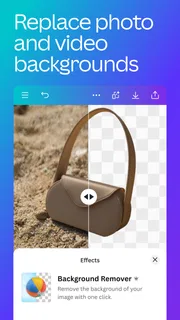
I can see why Canva makes a strong first impression. It turns a blank screen into a starting point quickly: I can begin with a design, adjust its text and images, and build something presentable without first learning a traditional graphics editor. That convenience is the app’s lasting appeal, not just its novelty. Whether it deserves a regular place on your phone depends on how often you need finished visual material and how much control you expect along the way.
Easy wins in the first week
Canva is an Art & Design app from Canva, and its mobile workflow is aimed at people who want to make rather than study design software. I found it particularly approachable for everyday jobs: a birthday invitation, a small business announcement, a club poster, a social post, or a short video assembled from existing material. Starting with a suitable layout removes the intimidating question of where everything should go.
The useful trick is to treat a template as a draft, not a finished answer. I would replace the sample wording first, then check whether the original type size still fits. Next, I would swap in my own image and review the design at the size people will actually see it. A layout that looks balanced on a large screen can feel crowded on a phone, especially when a headline has several words.
The app’s prompt-led generation can also help when I know the mood or subject I want but cannot find the right visual. I see that as a way to create options, not as a substitute for judgment. Generated material may not match a particular brand or message on the first try, so I would still compare it with the rest of the design and edit the surrounding text and colors to make the result feel intentional.
For a realistic first-week use, imagine needing a last-minute notice for a neighborhood event. I would pick a poster layout, put the date and location where they are easy to spot, and use one strong image rather than adding decoration to every empty space. Canva helps with the mechanics, but the best result still comes from deciding what a viewer needs to notice first. That distinction is important: the app speeds up execution; it does not automatically make every design clear.
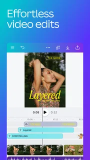
Video is another reason the first few sessions can feel productive. A quick promotional clip or a personal recap is less daunting when the project begins with a visual structure instead of an empty timeline. Still, I would keep a short video simple on a phone. Fine timing adjustments and repeated revisions are more comfortable on a larger display, while mobile is best for rough assembly, small edits, and sharing a finished piece.
What makes it useful after the novelty
After the first burst of experimentation, recurring value comes from having a repeatable workflow. If I regularly prepare announcements or social content, I can keep the same basic visual language from one piece to the next: similar colors, type choices, and spacing, while changing the message and image. That consistency saves more effort than trying a different flashy template every time.
More articles

Instagram Makes Everyday Moments Worth Sharing
A rare social app that can be a photo diary, a neighborhood window, and a lively conversation in the same session—though its best moments still require a little restraint.
A practical habit is to create one version that contains only the elements I expect to reuse, then duplicate it before making a new design. I would keep the reusable version tidy and avoid editing it directly for a one-off post. This small discipline reduces the chance of having to rebuild a familiar layout later and makes it easier to spot when a new design has drifted away from the rest of a project.
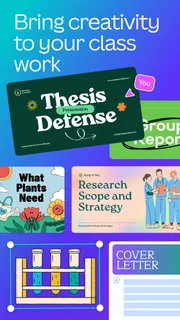
Canva has a broad audience: a student preparing a presentation, a volunteer making an event notice, or a small shop owner who needs a quick visual can all get something from it. The common thread is occasional design work where speed and accessibility matter more than precise control over every technical detail. If you only make one image every few months, it can still be handy, but the benefit is convenience rather than a habit you must maintain.
Its reputation is substantial, with a 4.8 average from around 28 million ratings and over 500 million installs. Those figures make it clear that it has reached far beyond professional designers, but popularity alone does not tell me whether it fits a particular workflow. I would judge it by how much time it saves on the kinds of visuals I actually make, not by how many tools appear on screen.
For someone comparing it with a conventional photo editor, the difference is the starting point. A dedicated editor is often the better choice when the main job is careful image correction, detailed retouching, or exact control over a photograph. Canva is more compelling when the photo is one ingredient in a complete communication piece with text, shapes, and a particular layout. It is closer to a design workbench than a specialist darkroom.
Keeping projects manageable
The maintenance burden is fairly low if I keep my projects focused, but it can rise when I save every experiment without a naming system. I recommend naming a finished item by its purpose and keeping drafts distinct from the version meant to be used. That is a modest step, yet it helps when a similar poster or announcement comes around again and I need the right starting point rather than a folder of near-identical attempts.
Before sharing, I would make a deliberate review pass for small errors: spelling, dates, contrast, and whether text sits too close to an edge. Template-based design can make a piece look polished before its details are correct. A fast check at normal viewing size is more valuable than adding another decorative element, and checking the exported or shared result prevents a surprise that was hard to notice while editing.
There is also a meaningful trade-off between using a ready-made layout and building something more distinctive. Templates help me finish quickly, but choosing a popular-looking arrangement without adapting it can make several unrelated posts feel alike. Changing the image alone may not be enough. I would adjust the hierarchy, remove a decorative piece that does not serve the message, and use wording that sounds like the person or group behind the design.
The app is free to download, with in-app purchases ranging from $1.49 to $300.00 per item. That makes it sensible to begin with the free experience and decide whether a paid option solves a recurring problem, rather than paying because a locked tool looks tempting in the middle of a one-time project. If your needs are occasional, a free workflow may be all you need; if you work with designs frequently, consider the actual time saved before committing to extra spending.
Where the friction appears
The biggest source of fatigue is not that Canva is difficult; it is that having many possible layouts and visual choices can turn a five-minute task into a long session of browsing. I try to set the goal before opening the editor: who will see this, what should they remember, and what is the one action or detail that matters? That brief keeps the design from becoming a collection of attractive but competing elements.
Mobile editing has its own limits. A finger is less precise than a mouse, and a compact screen makes it harder to judge fine spacing or compare several versions side by side. I am comfortable making a quick update on the go, but for a project that needs careful alignment, multiple pages, or lots of revisions, I would move to a larger screen if that is available. A desktop-oriented design tool may also suit someone who needs more exact control or already has a specialized production workflow.
Another possible fatigue point is maintaining consistency across work made at different times. It is easy to change fonts or colors while exploring and end up with a collection that does not feel connected. I would write down a few simple visual rules for a recurring project and reuse them. This is not a complicated brand system; even a consistent headline style and a restrained color palette can make repeated posts feel deliberate.
Canva is rated for Everyone 10+, so it is accessible to a broad range of users, though younger creators may still benefit from an adult helping them review public-facing material and any purchases. The app is currently version 2.383.0 and requires Android 8.0 or later on Android. It is also available as an app for iOS, making it a practical option for people who switch between common mobile platforms.
Who should keep it installed
I would keep Canva on my phone if I often need to turn an idea into a usable visual without opening a complex desktop program. Its best recurring role is as a flexible helper for small, frequent jobs: updating an event graphic, assembling a simple video, or making a post that needs both imagery and readable text. The value grows when I reuse layouts thoughtfully and know when to stop polishing.
I would not make it my primary choice if my work depends on professional image retouching, highly controlled illustration, or exact production requirements. In those cases, a specialist editor offers a more focused set of controls and may be less distracting. I would also skip it if I dislike template-led design or know I will spend more time browsing options than creating anything. Canva’s breadth is useful, but breadth can be a distraction when the task is narrow.
My long-term verdict is positive, with a clear condition: it earns space through repeated practical use, not through endless novelty. Its 500 million-plus installs reflect its broad reach, while the real reason I would recommend it is more modest—it makes common design tasks feel achievable and quick. Start with one real need, adapt a layout rather than accepting it untouched, and keep the final review focused on clarity. If that routine saves you effort month after month, this is an app worth keeping.
Pros
- Templates make it easy to create polished designs quickly.
- The drag-and-drop editor is approachable for beginners.
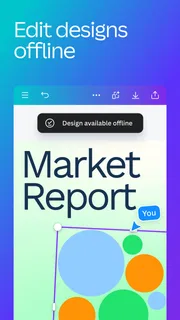
- Projects sync across devices when signed in.
- Built-in collaboration tools support shared editing.
- The app covers social posts presentations and short videos.
Cons
- Many premium templates and assets require a paid plan.
- Some editing tools feel cramped on smaller phone screens.
- Advanced design work can be slower on mobile than desktop.
- Export options and quality may vary by file type.
- A stable internet connection helps access cloud content.


